This is actually an article I wrote 3 or 4 years ago, but I came across it when I was looking for content for a clients newsletter and though I would share it with you.. It's a fun run through of some of the unique "characters" we run into in the web designer/developer world. If I missed a type l let me know in the comments.
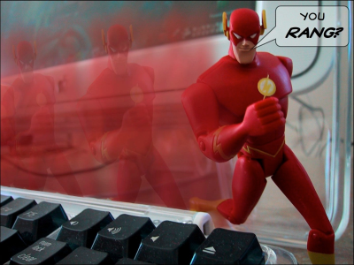
1. The Human Flash –
This individual believes that every website should be flash. They will tell you that NOBODY uses html anymore. They will justify the website costing 5-10 times as much to do everything in flash by saying that it will look a LOT cooler.
2. The Dark Horse –
Will only do black backgrounds and white text. Doesn't really care that your target audience isn't 18-25 year old Goths or gamers. Designs the site the way they like it.
3. The Microsoft Manipulator –
Yep I'm picking on everybody – The Microsoft Manipulator will always go for Microsoft based tools without reviewing the actual customer requirements. He'll also refuse to make sure that his web site works on Firefox or a Mac stating they SHOULD be using Internet Explorer.
4. Egomaniacial Coder –
This individual feels that they need to write everything from scratch and charge you for it. – warning sign – he tells you that the e-mail programs out there are all designed wrong and that he is going to write a new one for you
5. The Widget Warrior –
this individual will fill your page up with so many widgets and spinning objects that it will take a week to download on the average home PC – Famous phrase – it works fine on my machine
6. The Mac Maniac –
This individual believe that Microsoft is the enemy and will tell you that at every turn. They are welcome to their opinion. But since most of the world uses Internet Explorer it REALLY IS important that it displays correctly on IE. Phrase to watch out for, Well everyone should be using a Mac…it's better
7. The Linux Lackey –
This individual is the geekier, less hip version of the Mac Monster. He also believes that Microsoft is the enemy, everything should be open source and everyone should be using Opera or Firefox for their browser.
8. The Bored B.A. —
they've found that the only way that they can make a living with their Art degree is to do websites. Warning signs – they tell you that they have a wonderful inspiration for your web design as they pull out the watercolors or pencils….
9. Jeremy —
The neighbor kid, friends' kid etc – He's usually named Jeremy. He had a class in html in high school and has built a one page website. The biggest issue with these kids is that they are usually a combination of several of the above without and real knowledge or direction.
10. The Cranky Copywriter –
"Images are a waste of space — copy is what sells"
11. The Lazy Layout artist –
Every one of their websites looks exactly alike
12. Last but not least … The Perky Perfectionist –
They are ALWAYS "almost" done…kind of like this list of the top 7, I mean 10, I mean 12 Scariest Web Designers!


